
A Fresh New Look for the Series!
If you've been following me for a while, you might have noticed that I've been working on something behind the scenes for quite some time now. And I'm finally ready to share it with you!
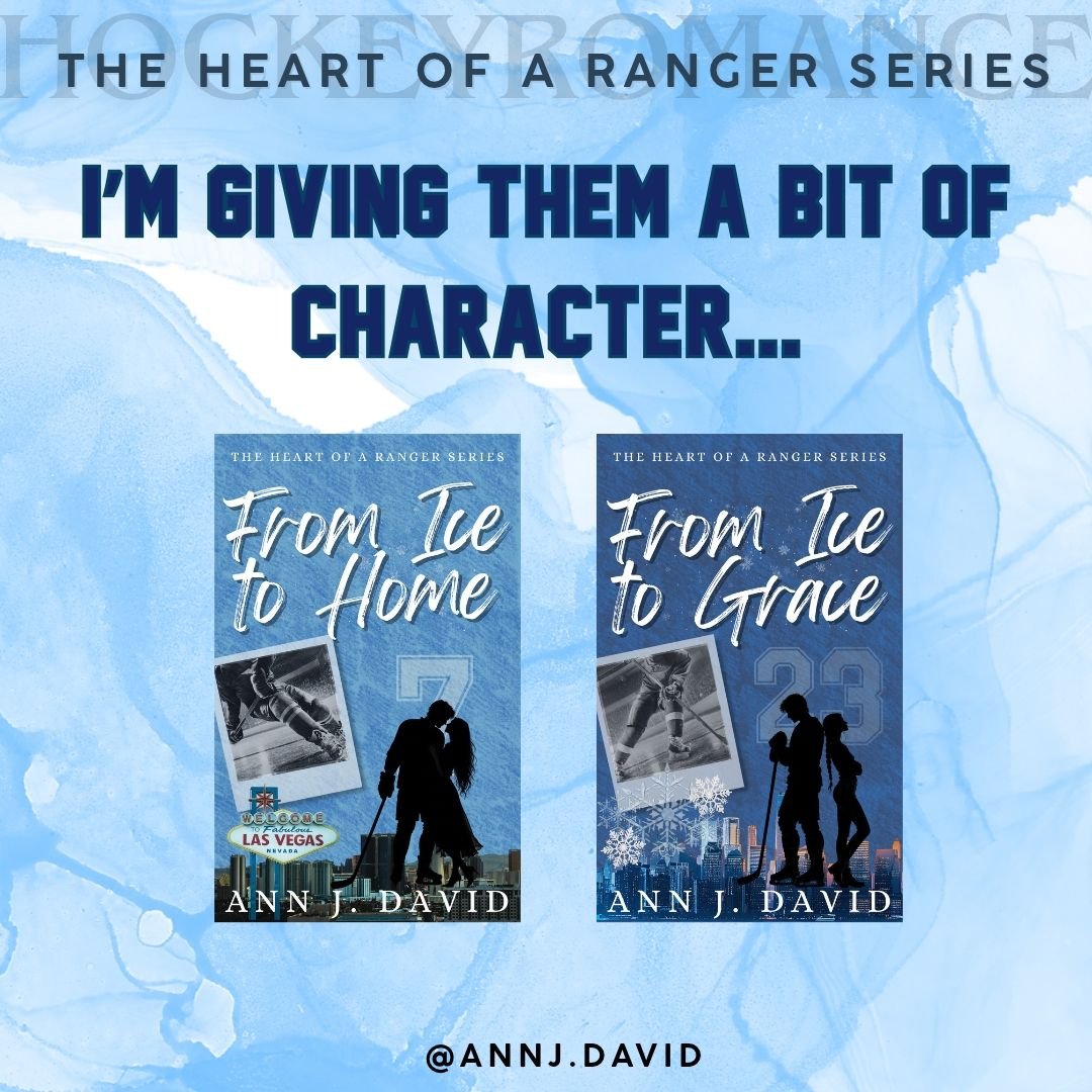
The series is getting NEW COVERS!
Now, if you know me, you know my brain absolutely loves uniformity. Give me matching fonts, consistent layouts, and a series where every book looks like it belongs together, and I'm a happy girl.
But here's the thing I've had to learn: sometimes, what makes sense to my brain doesn't necessarily make the most sense to my readers.
As much as I love having all the covers look similar, I also understand how that can get a little confusing. When the books share such a similar look, it can be difficult to distinguish one from another at a glance. And while I want readers to recognise that these books belong to the same series, I also want each story to have its own identity.
So, after a lot of experimenting, tweaking, second-guessing, and probably staring at these covers for far too long, I decided it was time for a change.
And honestly? I'm so excited about how they've turned out!
I've had some amazing feedback from my exclusive reader club, which has made me even more excited to send these new covers out into the world. There's something special about getting to share a little piece of the creative process with readers who are invested in these stories. Their feedback has been invaluable, and I can't wait for everyone else to see the finished designs.
But there's a reason behind the colours I've chosen, too.
I wanted each cover to reflect the feeling of its story. Because while these books belong to the same series, they don't all carry the same atmosphere, and I wanted the covers to communicate that.
Declan and Avah's story has a darker, grittier edge to it. Their journey carries a different kind of weight, and I wanted their cover to reflect that. The darker colour palette felt like a natural fit for the story they have to tell.
Hannah and Lucas, on the other hand, have a colour scheme that's closest to the original blue. Their story was the first one in the series, and I wanted to keep a little piece of the original design alive in their new cover. It's a small nod to where everything began, while still giving their book a fresh look.
And then there's EJ and Amelia. Their cover has a lighter, sharper blue, inspired by Sweden, the ice, and the forbidden romance at the heart of their story. I wanted something that felt crisp and cool, with a little edge to it. Something that would capture both the icy world of hockey and the tension of a romance that shouldn't happen.
The idea is for each book to have its own visual identity while still feeling like part of the same family. Different colours, different moods, but one series.
It's been a long process getting everything to a place I'm happy with, and I'm sure you can imagine how many little details go into something that might look as simple as a book cover. But that's part of the fun, isn't it? Finding the right way to represent the stories that have lived in your head and heart for so long.
I'm really proud of these new designs, and I hope you'll love them as much as I do!
Now, if you've already seen the covers, I'd love to know what you think. And if you haven't, keep your eyes open, because I'm so ready to share them with you! 💙